
Population distribution in Europe
When I saw this grid associated with a data file, I immediately wanted to use my “poor man’s mapping.” Instead of using a suitable application, I created a scatter plot with latitude on the vertical axis and longitude on the horizontal axis. I had also never tried to represent two million points in Excel, and that was tempting.
First attempt: the scatterplot
I started slowly because my computer’s processing power was, well, limited. So, instead of displaying the entire table, I filtered the data for the Iberian Peninsula:
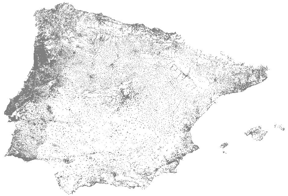
Grid cells are 1x1 km, and the point is displayed only if some population is present. This format already gives us an idea of population distribution but does not differentiate between one and a thousand people in a grid cell. You would need to create multiple series by population volume because that’s the only option to encode information into a data point in a scatterplot, which means millions of formulas. I don’t think my computer would like that.
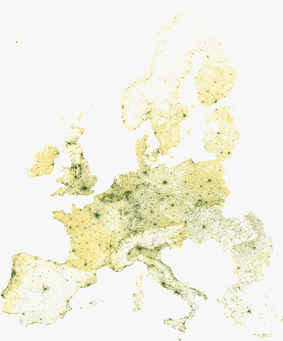
A better idea: pivot table with conditional formatting
A more immediate way of displaying a grid is through the use of a pivot table. Start by setting the column width and row height to the minimum value, associate latitude with rows and longitude with columns, and you get a grid prepared to be visualized. Then use conditional formatting to generate the map.
To avoid the impact of extreme values on the color ramp, avoid using the minimum and maximum values to define the range of values. In this case, I used the 10th percentile for the minimum value and the 90th for the maximum value. Here’s the result:
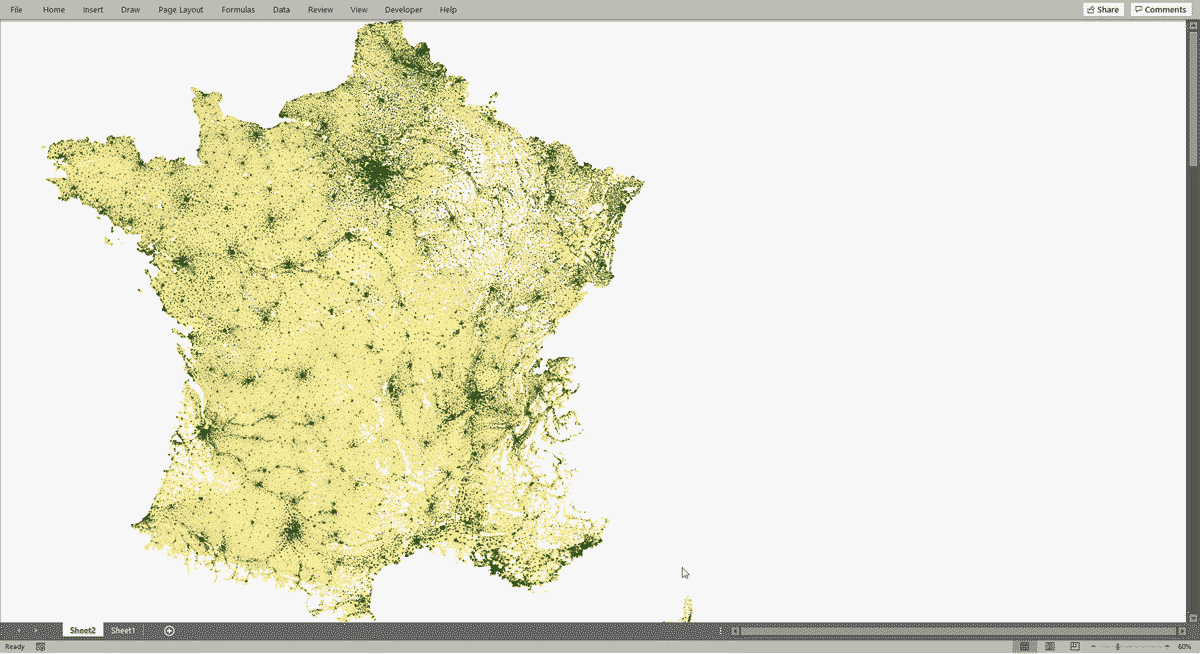
An interesting effect of using the pivot table is that we can filter the data for a single country or area, and everything adjusts automatically. Here is a screenshot with a resolution of 1920x1080 when I choose France:
Pivot tables: hidden potential for information visualization?
“I didn’t know you could do this in Excel” is one of the most common reactions I get when I make a chart that isn’t in the chart library. In general, those who explore other potentials focus a lot on graphics. Conditional formatting, especially with pivot tables, has received less attention, which is a shame. As the example shows, it is possible to make excellent visualization, and the pivot table with conditional formatting is also a good starting point for exploring the data.