
Data visualization for office users
Note: The tutorial is the same available in Skillshare, so you can watch it there if you have an account.
If you are a non-designer user in need of a non-garden-variety introduction to data visualization, you came to the right place! In this video class, you’ll learn things like:
- data visualization is like a kitchen robot;
- to make pretty charts, you shouldn’t care about aesthetics;
- color is not that hard;

Based on my book Data at Work, this hour-long video tutorial explains how to create a safety net that helps you be aware of (and avoid) design blunders common among office users. It will also show you:
- why context matters and how to use it;
- why bashing pie charts is wrong;
- how to come up with the right questions;
- how to avoid spaghetti (the wrong kind).
Share your before-after pictures
Let me tell you a secret: good data visualization is often recognized only when comparing two versions of the same message. I encourage you to choose an old chart that you can make public, redesign it after watching the tutorial, and share it with comments. Doing this helps everyone to learn from specific cases.
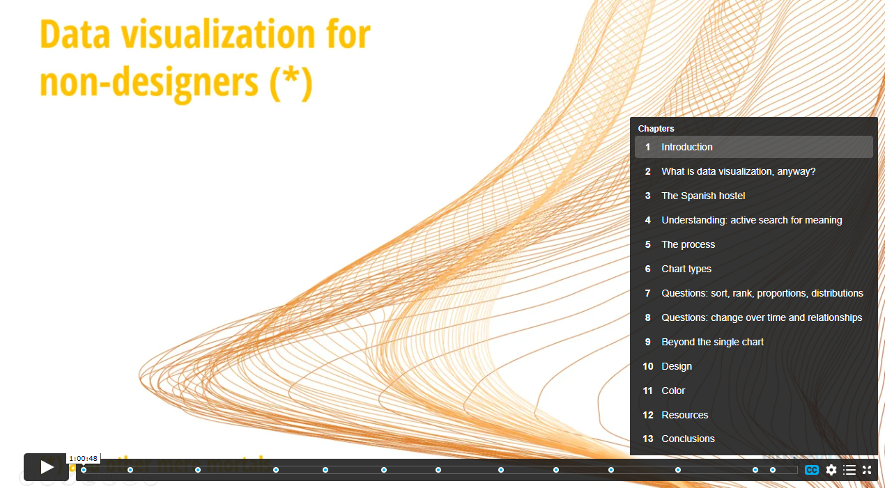
Structure
While the tutorial is one hour long, it takes advantage of Vimeo’s chapters feature to mark each section. Here are the main topics:
Accessing the tutorial
The tutorial is hosted on Vimeo, where you can rent it for USD 14.99 for six months or buy it for USD 47.99, in which case you can access it for as long as it remains on Vimeo. You also get whichever updates I make during that period.
I narrated the tutorial in English, which meant that both the narration and the English could (will) be improved. But you can mute it and read the subtitles, in English or Portuguese (more to come).
Go to the tutorial page now (you’ll be taken to Vimeo)