[Excel] How to make an area chart
Video tutorial on how to make an area chart in Excel
 Video tutorials
Analyzing change over time means that you want to identify shapes created by multiple data points, like trends or temporal patterns. The best geometry to find these shapes is the line. While you can use bars to display data over time, they favor point comparison, so this is not an actual analysis of change over time. Things are much more blurred in practice, but this distinction between shapes and points is helpful to clarify the message you want to communicate..
You can display at least five (plus two) types of temporal change:
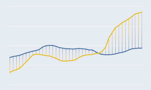
For a correct display of time, it is necessary to understand time as a quantitative variable, ensuring that the spacing along the axis is proportional to time intervals. Otherwise, the trend’s shape is inaccurate.
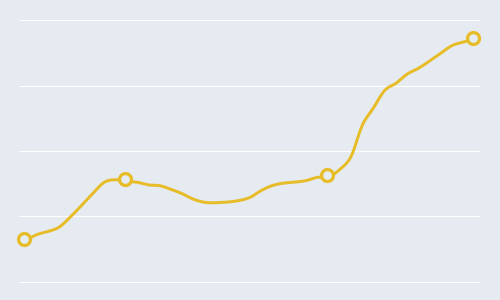
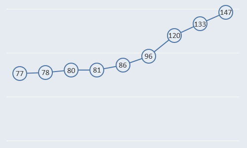
When reading a line chart, we get our cues from slopes. Except for positive or negative, slopes don’t have an intrinsic and absolute meaning because the chart’s aspect ratio and the axes’ scales affect it.
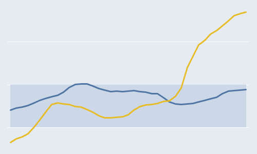
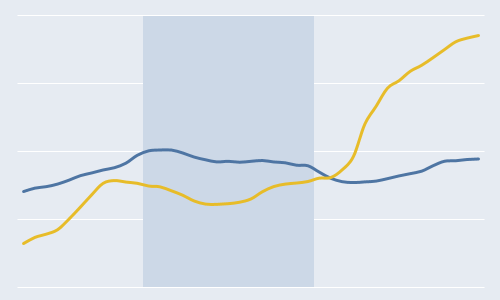
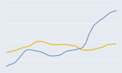
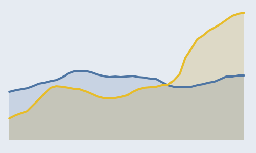
The y-axis scale doesn’t have to start at zero, so you can focus on a more useful concept, resolution. Low resolution means that the scale is too wide, lines become almost flat, and relevant variation is hard to spot. On the other hand, high resolution means that the data’s minimum and maximum values are close to the scale’s beginning and endpoints. The high resolution makes variation easy to spot, but we risk focusing too much on the change intensity. To minimize this, it’s always advisable to represent more than one series so that you can compare slopes. Reference lines and bands of variation are also helpful.
Your main goal when using a time series is to identify relevant trends and temporal patterns. Untangling this can prove not easy if you have too many intertwined series (the spaghetti). You don’t need to remove them: gray out the series that contribute little to your core message but are useful to provide context. Another option is to split the chart into small multiples.
Video tutorial on how to make an area chart in Excel
Video tutorial on how to make a line chart with horizontal highlight in Excel
Video tutorial on how to make a line chart with markers in Excel
Video tutorial on how to make a tensile line chart in Excel
Video tutorial on how to make a line chart with vertical highlight
Video tutorial on how to make a line chart with extra large markers in Excel
Video tutorial on how to make a simple line chart in Excel
Video tutorial on how to make a step chart in Excel