![[Excel] How to make a 100% stacked bar chart](/assets/images/img_video/video-tutorials-header.png)
[Excel] How to make a 100% stacked bar chart
A 100% stacked bar chart is used to compare proportions across multiple entities, like age structure by country.
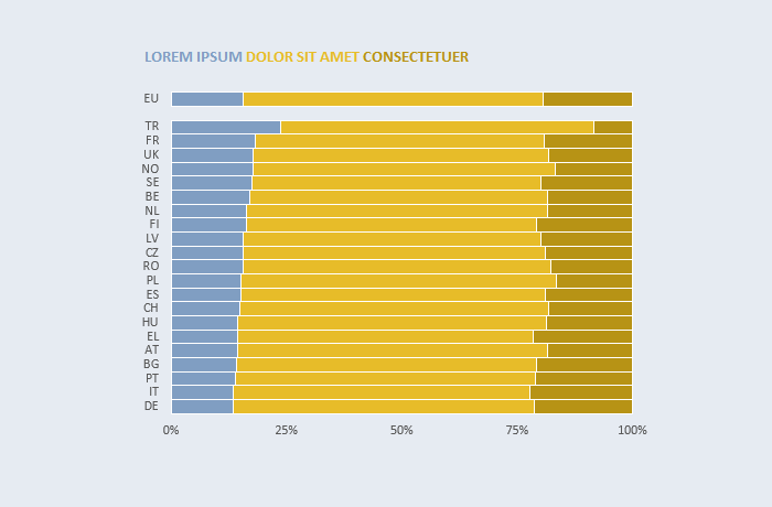
Design notes
- You often can use title font color to replace the legend.
- Use a different hue to emphasize a series.
- Use 25% instead of 20% intervals to have a middle point.
- Sorted by the first series.
- Moved reference entity (“EU”) to the top. You can emphasize it a bit more by separating it using an empty row.