![[Excel] How to make an area chart](/assets/images/img_video/video-tutorials-header.png)
[Excel] How to make an area chart
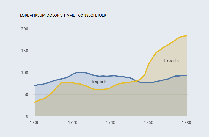
Transparent areas not only make the chart cleaner and lighter it also helps differentiating between overlapping and stacked areas.
Design notes
- Area charts display an outline all around the area, while in most cases you’ll only want the outline at the top. A solution is to add the series twice, setting one as area chart ant the other as line chart. Disable the outline for the area series.
- It’s not always obvious when the areas overlap or are stacked. Lines and transparencies help minimizing this issue.
- The suggested guidelines for area and bar charts regarding the y-axis are similar: start the scale at zero.
- Instead of a legend, add label to one data point and place the label inside the area.
Video
https://vimeo.com/643244473