![[Excel] How to make a bullet chart](/assets/images/img_video/video-tutorials-header.png)
[Excel] How to make a bullet chart
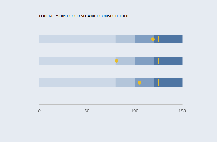
Bullet charts are much more space-efficient that gauges and make comparisons easier.
Design notes
- In this example, all the three KPI share the same thresholds, base on a single X series. You can define X series specifically for each KPI.
- You can have as many classes as you like (and make sense).
- Encode “intensity” with a single hue and vary luminosity/saturation. Avoid the red-yellow-green encoding.
- Targets use error bars for vertical markers, while Actual uses the standard markers.
- But Target and Actual use the secondary y-axis, otherwise they would be hidden by the bars.
Video
Notes
- 01:25: repeated steps: repeat the format applied to the top KPI to the remaining two.
- 01:30: adding values for target and actual.
- 01:50: move target and actual to the secondary axis
- 02:00: change target and actual series to markers only (no line).
- 02:33: Since there is no vertical dash, the target marker is hidden and y-axis error bars are used instead.